Foster + Partners:
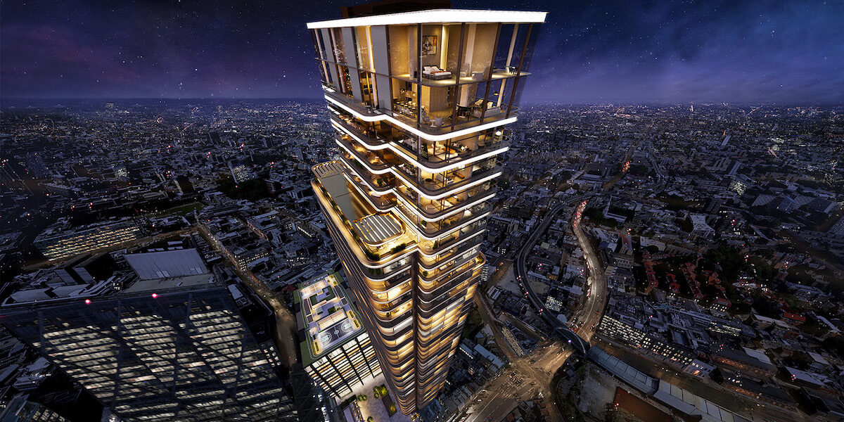
Foster and Partners are a London-based Architecture firm known across the globe for their striking, modern architecture. They are the largest firm in the UK and have created many recognisable developments across the London Skyline, an example of this is the Gherkin and Principal place in London.
Foster and Partners are a large influence on my portfolio, having seen many of their developments across cities like London, Sydney, NYC and Mexico City. They have influenced my portfolio and my designs through their use of Geometry to create modern, unique designs and through the way they prioritise sustainability. Parts of the Norwegian House were inspired by architecture from Foster and Partners.
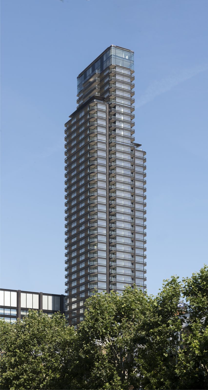
Principal Tower is a luxury, 163m tower in Shoreditch, London. It is described as “The epitome of understated elegance” and was designed to give the feel of a priceless piece of art. It has achieved this by modernising art-deco architecture from the local area as to create an icon that fits the geography and culture around it whilst still being unique and recognisable. Principle tower was an influence on my designs as it taught me the importance of studying the local context and culture when designing a building.
Taylor Mazer:
Julia C Schmitt:
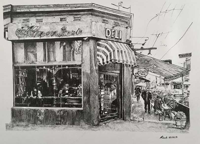
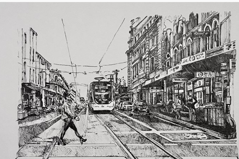
Julia schmitt is a Melbourne based artist that draws urban landscapes as a detailed monochromatic depiction. She frequently draws shopfronts and buildings in fine-liner. Schmitt was the direct reason that I started using fine-liners. Before coming across her work, I would only work in Pencil, but after seeing her art and the amount of detail that can be achieved, I then had my first attempt at detail fine-liner art. This is the stair and street in Camden.
Schmitt works in Fine-liner as it allows her to achieve much higher levels of detail. Schmitt attempts to re-create the composition and objects seen around her and captures the scene through her own depiction. She uses techniques like cross-hatching and low ink pens to give different tones and textures. This, again, was a direct influence on my art.
Her artwork contains a feel of life, almost as though it is a snapshot that contains the movement and liveliness of a Melbourne street. This is something that has directly influenced my art, her inclusion of urban characteristics like Graffiti, litter and decay that most would leave out gives the drawings both a sense of realism and life. This has also had a direct influence on my art and is the reason I try and include everything I see in my art.
Jean Nouvel:
Jean Nouvel is a French-born architect. He was born in 1945 and has received many rewards for his projects. I have come across a few of his designs in Sydney, Zurich and Barcelona.
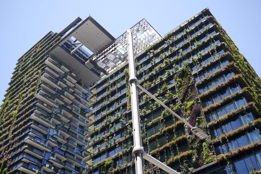
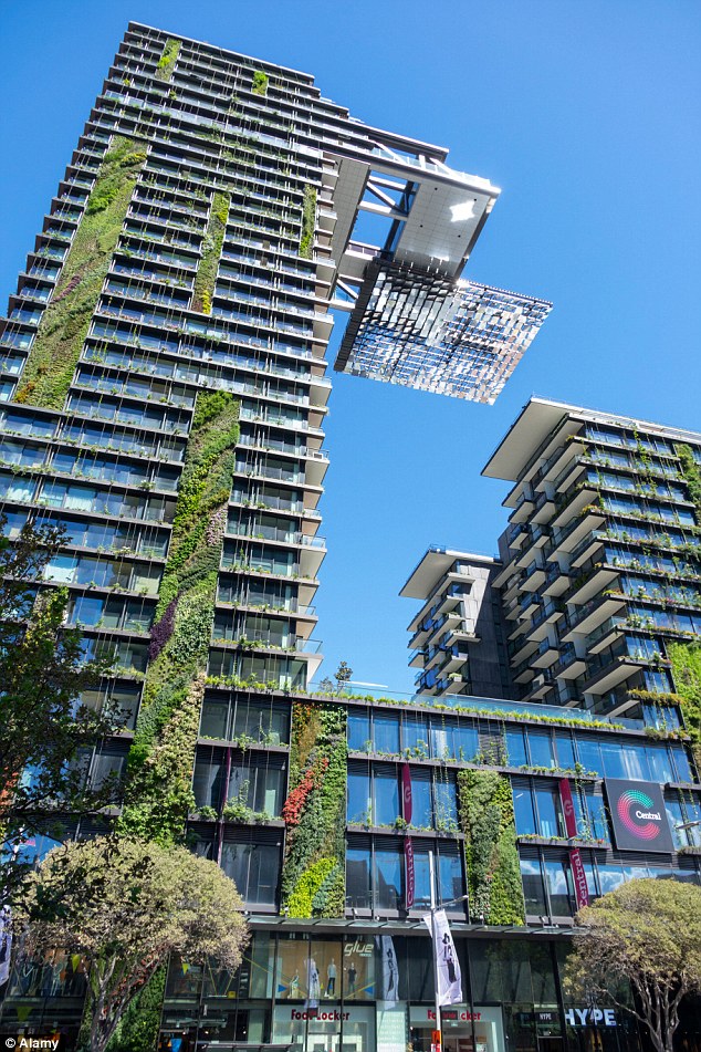
Nouvel is known for creating very striking and unique designs. This is shown through his design of One Central Park in Sydney, Australia. This striking building is designed to be a “Powerful icon of geometry in the Sydney Skyline” and is a vertical extension of an Urban Park. This merge between park and building is seen through the facade of the building, 50% of it is covered in a vertical, green landscape. This was done to be much more green and protect apartments from direct sunlight during the summer months. The Building is marked by its 2 overhangs that make it very recognisable, this gives residents panoramic views of the city skyline as well as giving the building an incredibly futuristic look. The building symbolises the futuristic and sustainable feel of Sydney.
This use of geometry and striking composition is a technique that I have been inspired by directly and can be seen in the Australian concept house as well as the Norwegian house design. The use of vegetation for aesthetic design and sustainability is something I have also used in the Norwegian house.
Jean Nouvel’s Artworks are unique and striking but still influenced by the context around them as to not overpower the skyline or local area. Nouvel designs buildings to be strong and powerful and described smaller buildings as a “Nervous vertical arrows”. His inspiration commonly comes from nature around him, for example, the Torre Agbar in Barcelona is inspired by water. To achieve a fluid look it was given a smooth and continuous surface that is bright and vibrant – a common theme seen across minimalist architecture.
Renzo Piano:
Renzo Piano is a Genoa born, Italian architect that has had a large impact across the skylines of cities that are close to me. He designed the Shard in London and several other noticeable buildings in London. His architecture company is also behind several buildings in Sydney, Australia such as One Sydney Harbour and Aurora place. Aside from these, I have also encountered several of his works across the world, such as the Astrup Fearnley museum in Oslo, Norway and the NY times building in New York.
Piano was the first architect to influence a change in my art. It was the shard that got me into Urban sketching and further down the line into architecture and cityscape drawings. His designs are some I have come into contact with frequently across the globe and are therefore large influences in my own designs and is work that I admire across many of my favourite cities.
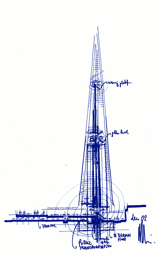
My favourite design by Renzo Piano is the London Bridge Tower, more commonly known as the Shard. The Shard is a minimalistic, Neo-fururistic skyscraper in London. It is the tallest building in Western Europe and was designed to stand out in the 2012 London skyline without being overpowering. Interestingly, architecture such as the Shard may have been uncommon in a 2012 London, there have been many similar developments all across the city since then. Buildings such as 22 Bishopsgate and the landmark pinnacle have all followed in the Neo-futuristic style of the shard – and reaching similar heights. The Shard was designed using special frames of glass to reflect sunlight in a specific manner to make the building seem less imposing as well as give the appearance of a single glass pane.
Buildings like the shard and Aurora place show geometric, minimalistic designs that have indirectly and directly inspired my own designs. Working in a very limited colour scheme and with very geometric designs that look both simple yet complex at the same time is something that I have taken into account in my own designs – as seen in the Norwegian house and in the Modern Australian concept house.
Santiago Calatrava:
Santiago Calatrava Valls is a Valencia born architect who is very well known and influential across the architecture world. He was born in 1951 and became famous for his use of organic shapes in building and bridge design. His most famous designs such as the World Trade Centre Transportation Hub (Oculus) and the City of Arts in his home city of Valencia all feature his characteristic use of organic shapes.
The oculus has received much criticism, costing $2 billion over budget and with many describing it as a monstrosity. For me, however, I think It represents the optimism and grandeur seen in modern day architecture. Despite its issues, the oculus can be appreciated as an incredibly ambitious project that attempts to merge nature and urban design, right in the heart of downtown NYC. Having visited the Oculus on several occasions, the size and ambition of the project amazes me. Whilst the design is different to my designs, there is an incredibly minimalistic feel that has influenced me and my designs, particularly in the modern Australian homes.
After seeing many of Calatrava’s projects such as the City of arts in Valencia, Oculus in NYC, Obelisco plaza in Madrid and several in Zurich, Switzerland, it is safe to say that Calatrava is one of the main reasons I have developed an interest in architecture. His use of nature and organic shapes have inspired me to look at the world around me to gain inspiration for the shape and composition of my own designs. For example, the concept Australian house was inspired by items on my desk and the Norwegian House was inspired by the shape of simplistic mountains, similarly to how Calatrava looks at the natural world for his compositions. Examples of this can be seen all across his work. The Oculus, for example, was inspired by the wings of a dove and the Turning Torso in Malmo was inspired by the human body.
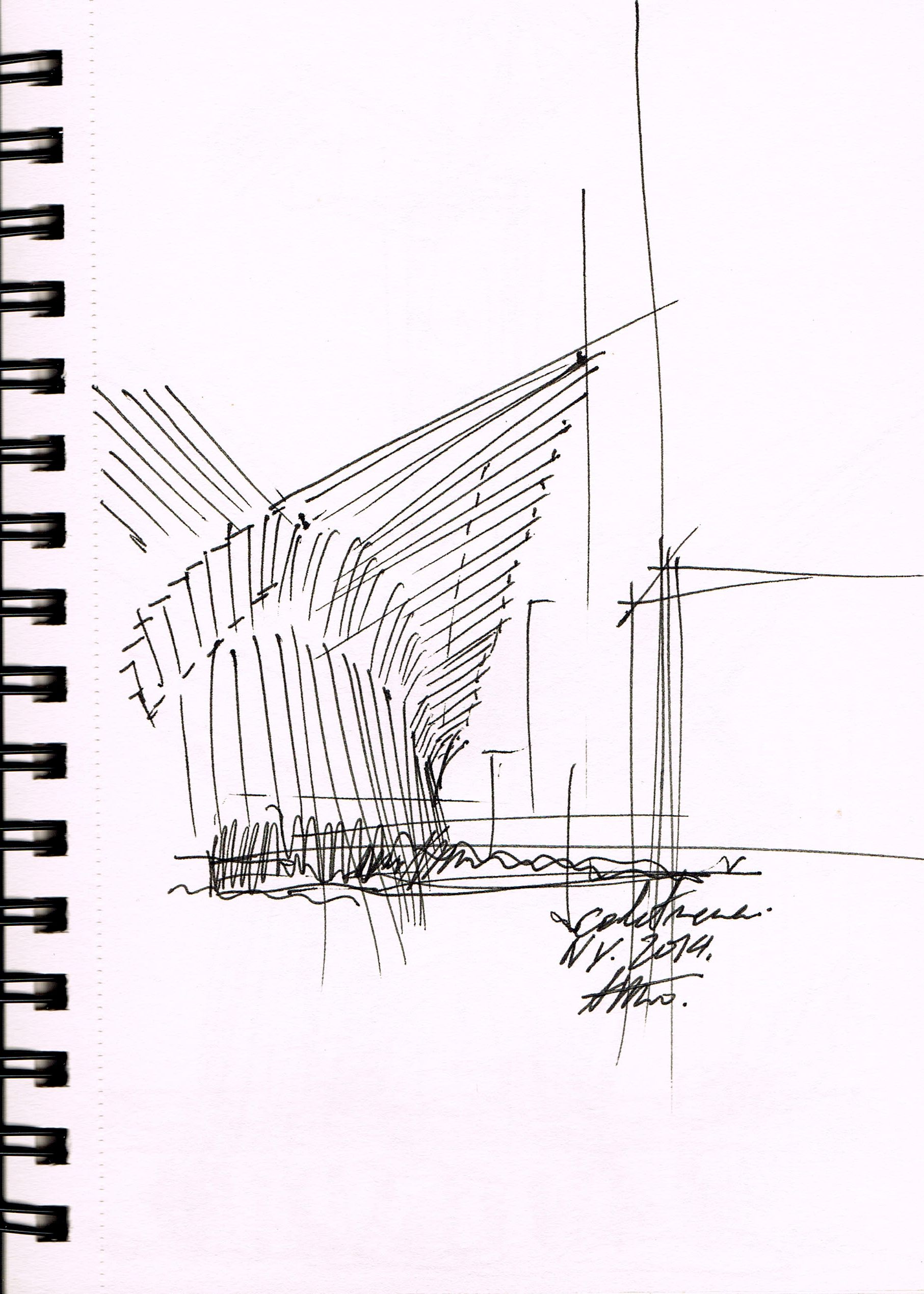
My favourite piece by Calatrava is the City of Arts Valencia. This is an ultra-modern city within a city that explores the boundaries between building and sculpture as well as the boundary between beauty and utility. The striking designs are meant to represent art, science and technology. The open, concrete design creates an incredibly futuristic design.
All in all, Calatrava’s work has influenced me greatly through his process and through his thoughtful application of shapes and ideas to achieve his intended purpose. Whilst Calatrava does not have the same aesthetic look as my designs, Calatrava has certainly had an impact on my methodology, composition and the way I introduce ideas into my designs.
